Fake Case Study02 - 12 - 2021

Redesign UI Bima+ App v2.0

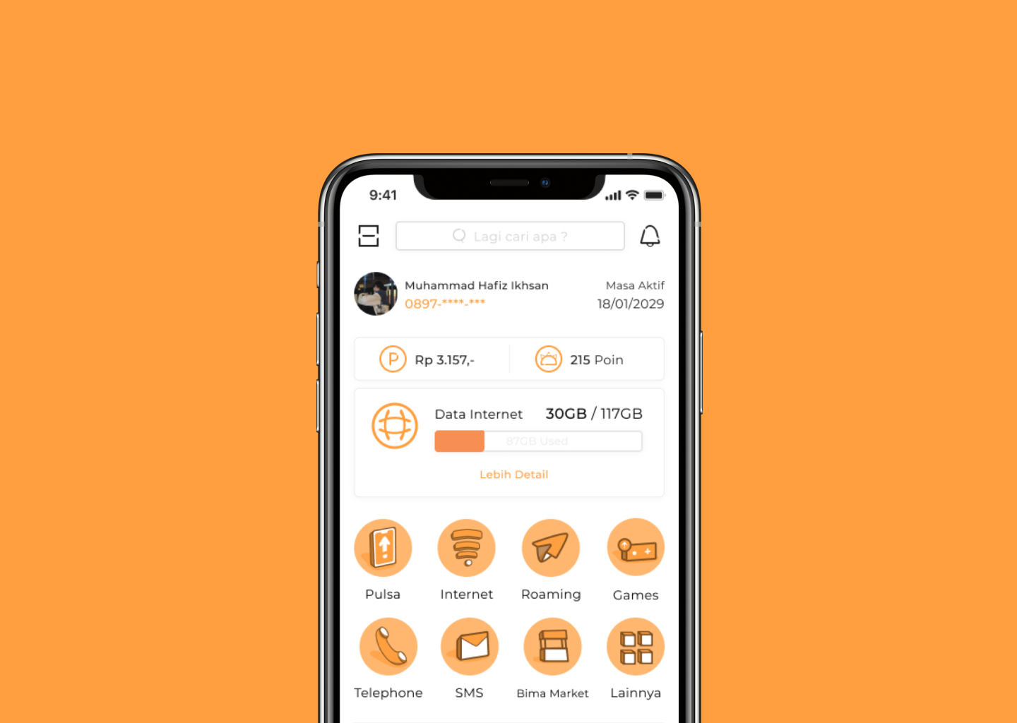
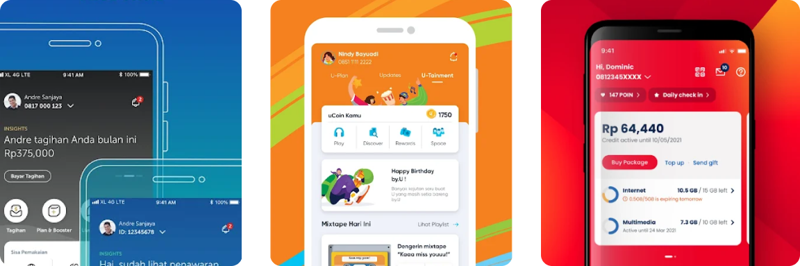
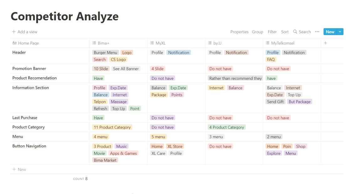
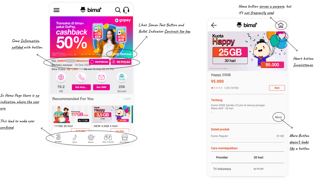
Founded in 2017, Bima+ is an service app that intended for user of 3/Tri cellular operators in indonesia. There were contrast issues and inconsistencies and the design is outdate comparing to other competitor app.

My Jobs

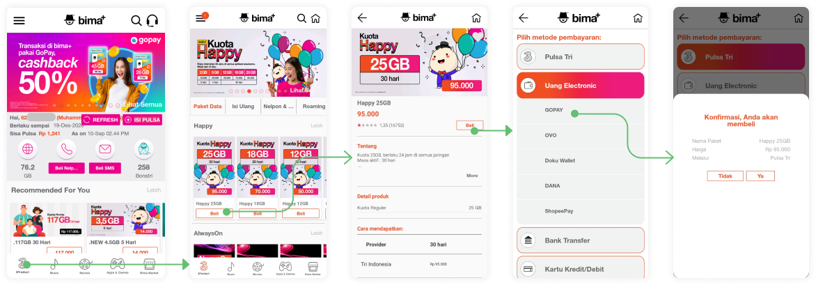
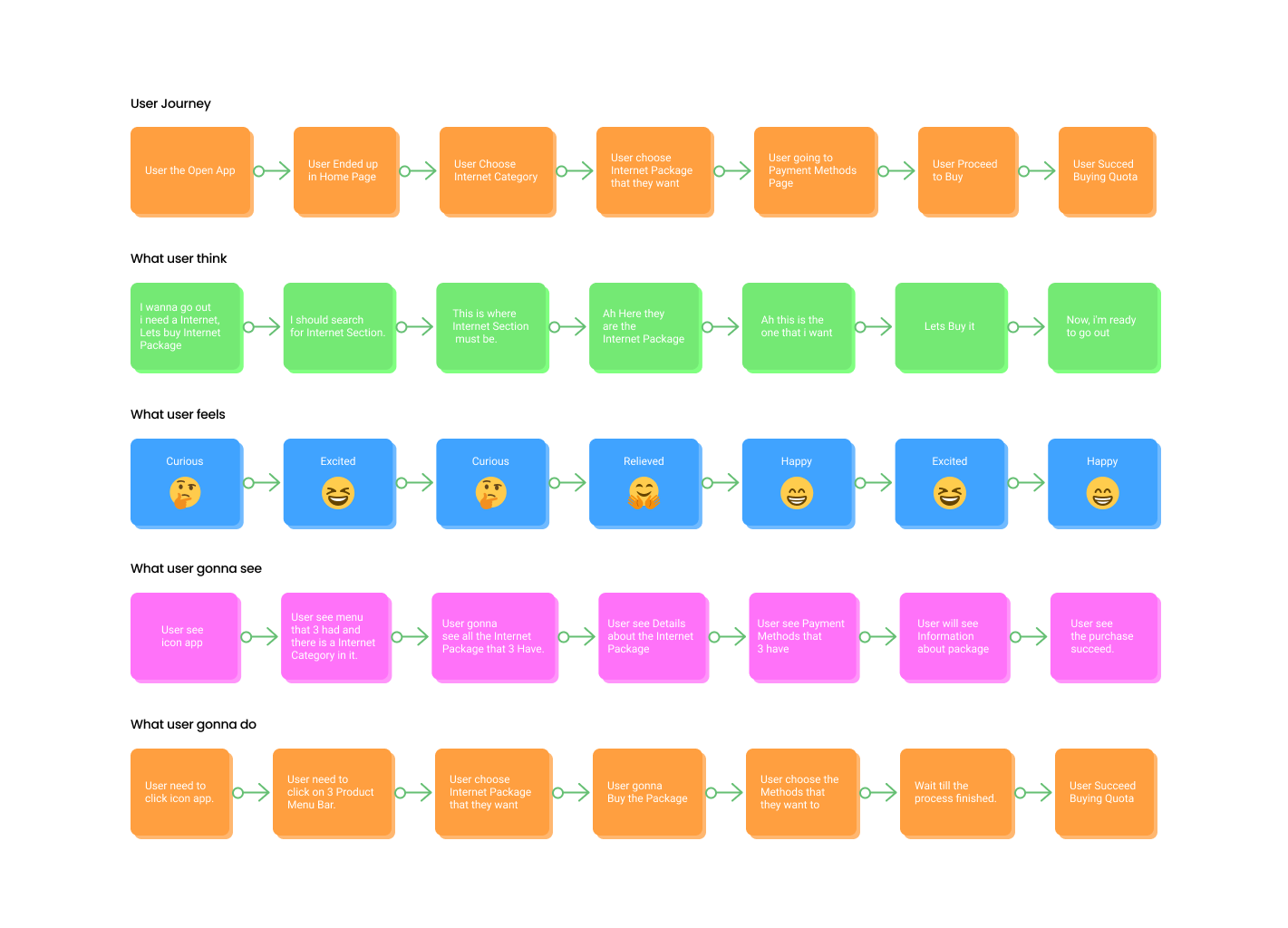
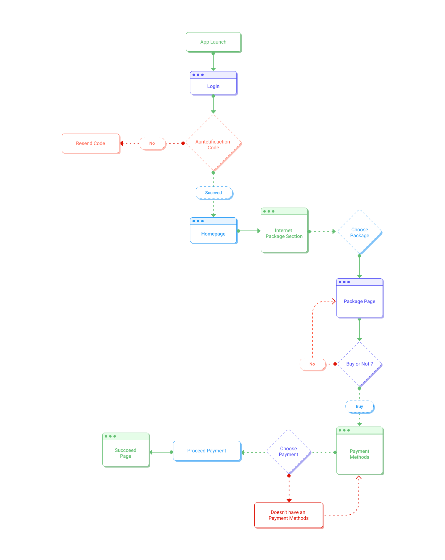
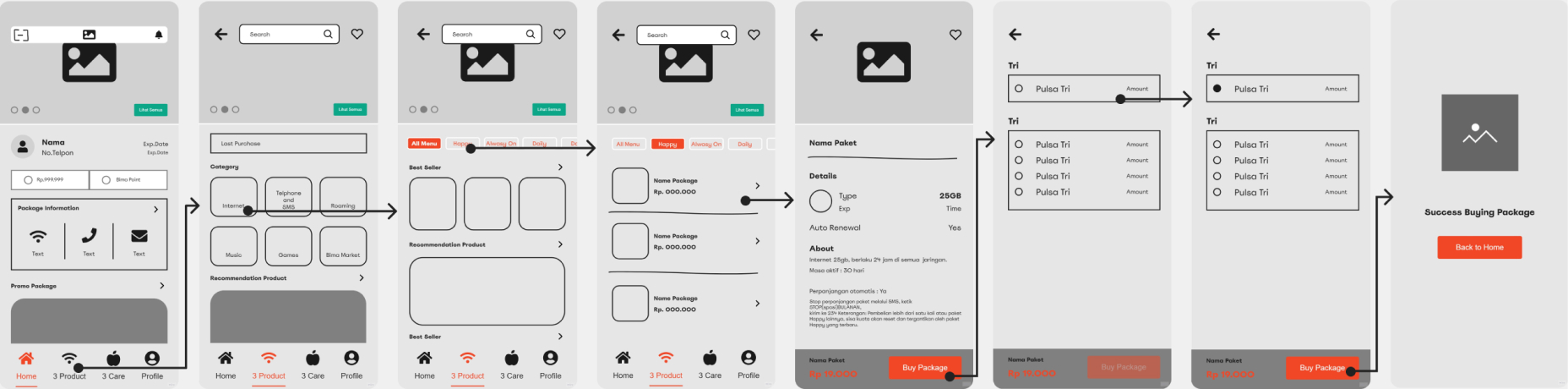
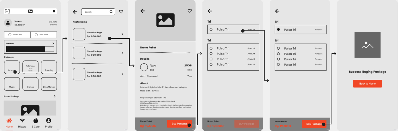
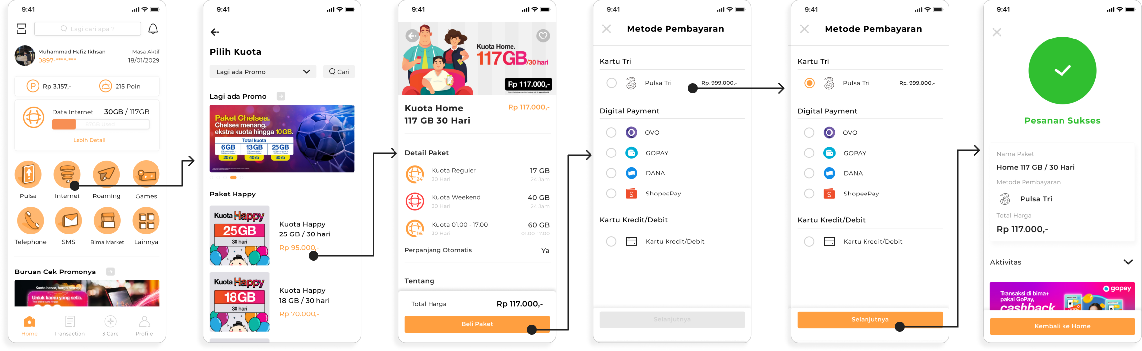
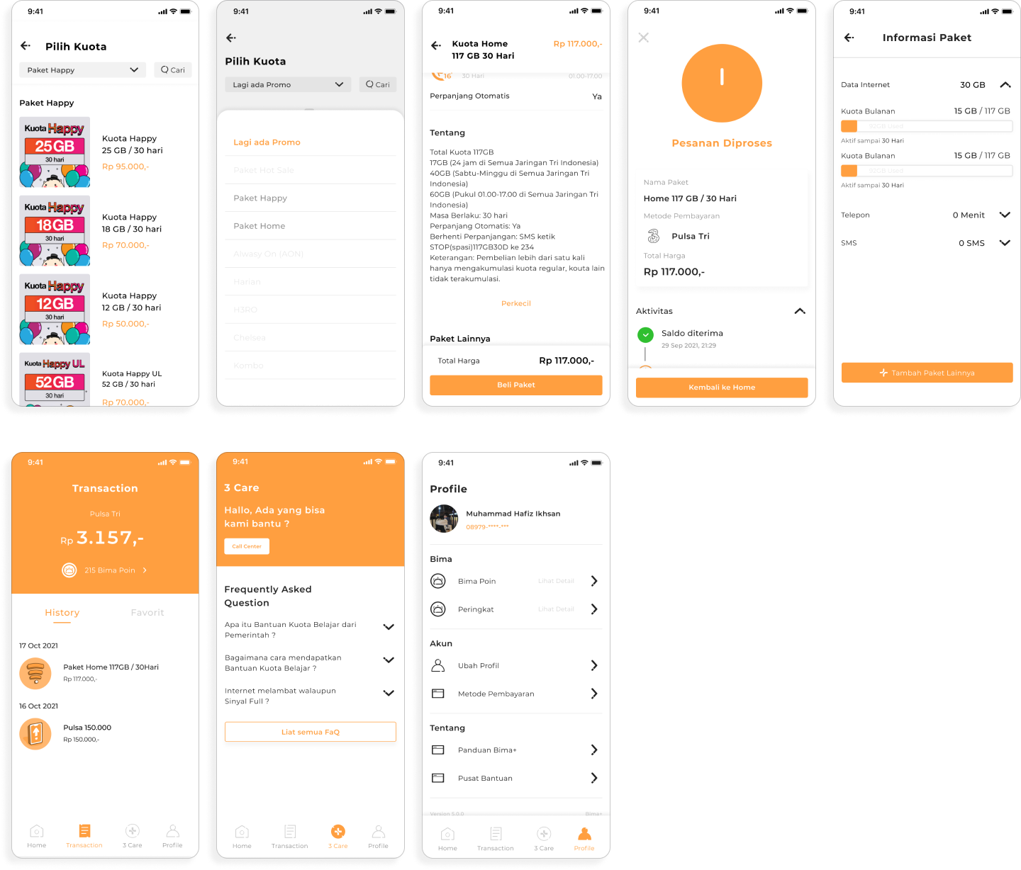
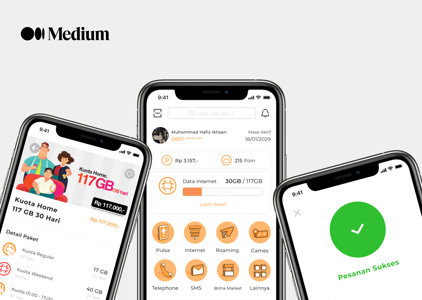
I intend to redesign the UI & UX and focusing on user buying internet quota.

The result is cohesive design, a visual update that leads to the fresh/new experiences for the user.

Examination Bima+

Problem

As the time goes by user prefers using an App rather than a Dial call. However, there’s a contrast issues, inconsistencies and Bima+ app design is outdate comparing to other competitor app . It negatively impacts experiences and brand trustworthiness.

User Flow when buying Quota

Competitor Analyze

After knowing about the user, i should know what is inside the app. To get an Insight about what is inside the app doing an Competitive Reasearch would be really helpfull.

Competitive Research really help me knowing about what is inside the app and the flow within the app that i’m gonna use later on to create Wireframes.

Wireframes

After knowing about the user and UI problems, it’s time for me to go to the next step and it’s Wireframing. Wireframing helps me knowing what kind of page that i build, i did some kind of experiment in the wireframing to know which one is better comparing to the others.

Version 1
Pros :
  • The Information that shows more clear.

Cons :
  • It takes more step/time for the user to buy an Quota and hard to swipe Quota Category if the menu was Swiped especially in the small phone.

Version 2 (The one that i choose)
Pros :
  • Straightforward menu where user can just jump on category right in the Home page.

Cons :
  • It may take less step than the other one but i think because it less, i needed to put some of the information on the others pages and it became to crowded by the information.

Iconography

I Intend to made a new Icons by myself, i tried to made an Isometric icon because from what i read " Isometric icons grab users attention and help them know where to click ". This is my first time made an Icon like this.

Prototyping

Prototyping

After i made all of the screen i tried to imagining how exactly the user interact with the screen so i made an Prototype.
You guys can try out the prototype below :

Reflection

What I learned

1. I try to decide what kind of process that i'm gonna do before doing the Redesign and it helps me to know how to do things faster, better, and more efficient.

2. Try to create all the possibilities that cames in my mind was really helpfull by creating all of thats i got to learn what works, and what works better.

I learn random things along the way while trying to learn about the thing I actually set out to learn. And from all of that The learning process is still continuous.\ “Design doesn’t get easier. You just get better.”

Side note : I do not work for Bima+ / Tri Indonesia, and the views from this case study are strictly my own. Unlike the designers who work at Bima+, I don’t have full access to all the user data that influenced their current design. As a result, this case study is not exhaustive, and I am certainly not suggesting that Bima+ abandon their current design and adopt my redesign.


Bima+ already updated their app to
v3.0 while i'm still working with the redesign so i’m still gonna go with the v2.0.

Back to Top